

There is art that calms.
There is art that provokes.
There is art that inspires.
Rarely does every piece in a collection manage to do all three, but on display at the Museum of Contemporary Art by Patchogue Arts Council on Terry Street, Tobi Kahn’s “Elemental” coaxes the viewer with a playful but poignant simplicity at first glance, only to invoke your imagination and illusions to craft a story all your own.
“This is the reason I make art,” said Kahn, “for someone to see it and develop their own views or ideas. My art is never complete until it is seen.”
Upon entering the gallery at MoCA, the eyes are bathed in shades of grey, blue, and green that are reflective of the natural wonders they are inspired by, but then glints of a burgundy/maroon red paradoxically peek out and position forward.
Kahn, who counts this mysterious and alluring shade of a color associated with passion and force, said his secret is the color alizarin crimson.
A shade that seems at both innocent and mature, the alizarin crimson, a translucent color, is usually combined with a cadmium red and/or oxide red base.
The resulting color is one that alerts us to a peak or a focal point in the art, but one that is fundamentally connected to the surrounding shades, like a symphony meant to support a soloist.
Keen to the environment and natural settings, Kahn, whose undergraduate degree in is in photography and printmaking (clearly evidenced by the carved texture of his paintings), starts off with a photo of a location.
Before digital photography, Kahn would photocopy an original print and begin to isolate the aspects of the image that spoke most to him.
In this balance of realism and artistic nuance, Kahn’s paintings leave enough tangibility for the viewer to travel, but enough ambiguity to still have wanderlust.
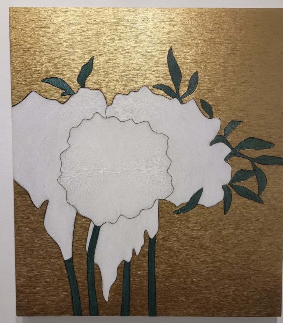
In “Tzelet,” gold is brought into the mix as a background color and conveys a dignified neutrality to contrast against the bold but virginal white flowers in the forefront. Whereas gold, or more specifically gold leaf, is typically used by artists as a highlight in small doses, Kahn’s usage as a demure backdrop is refreshing to the metallic color spectrum.
“Gold is usually combined with burnt sienna and raw umber because I don’t want it to be garish. When it’s pure gold, you forget about the image,” said Kahn. “As a front color, you wind up glorifying the metallics, but I work with them differently and I use pewter, silver, and copper as well.” The copper is also matched with Kahn’s favorite, alizarin crimson.
Demonstrating her abilities as a master curator, PAC executive director Beth Giaccummo coupled “RYKADH” and “OPHYH,” with the latter seemingly taken out of a despondent cartographer’s book, as two islands stand interested in each other but apart, like a chasm or a current.
As a student of Kahn’s, she was advised by him not to look at his work, lest he unduly influence her style, as he wanted his students “to arrive at their own process.” When Giacummo did finally view his work four years after his tutelage, she found herself so connected to it that it has been one of her lifetime reflections.
With both as Pratt graduates (Kahn holds a Master’s in Fine Art in painting and drawing; Giacummo a Master’s in Fine Arts in new forms), the connection of the two through the philosophy of art and the approach to life is evident in this culminating exhibit at MoCA in Patchogue.
Giacummo said of Kahn’s work, “His work always met me where I was and helped move me in the direction I needed to go. And ultimately, that’s why I think it’s so important to share his work.”


Comments
No comments on this item Please log in to comment by clicking here